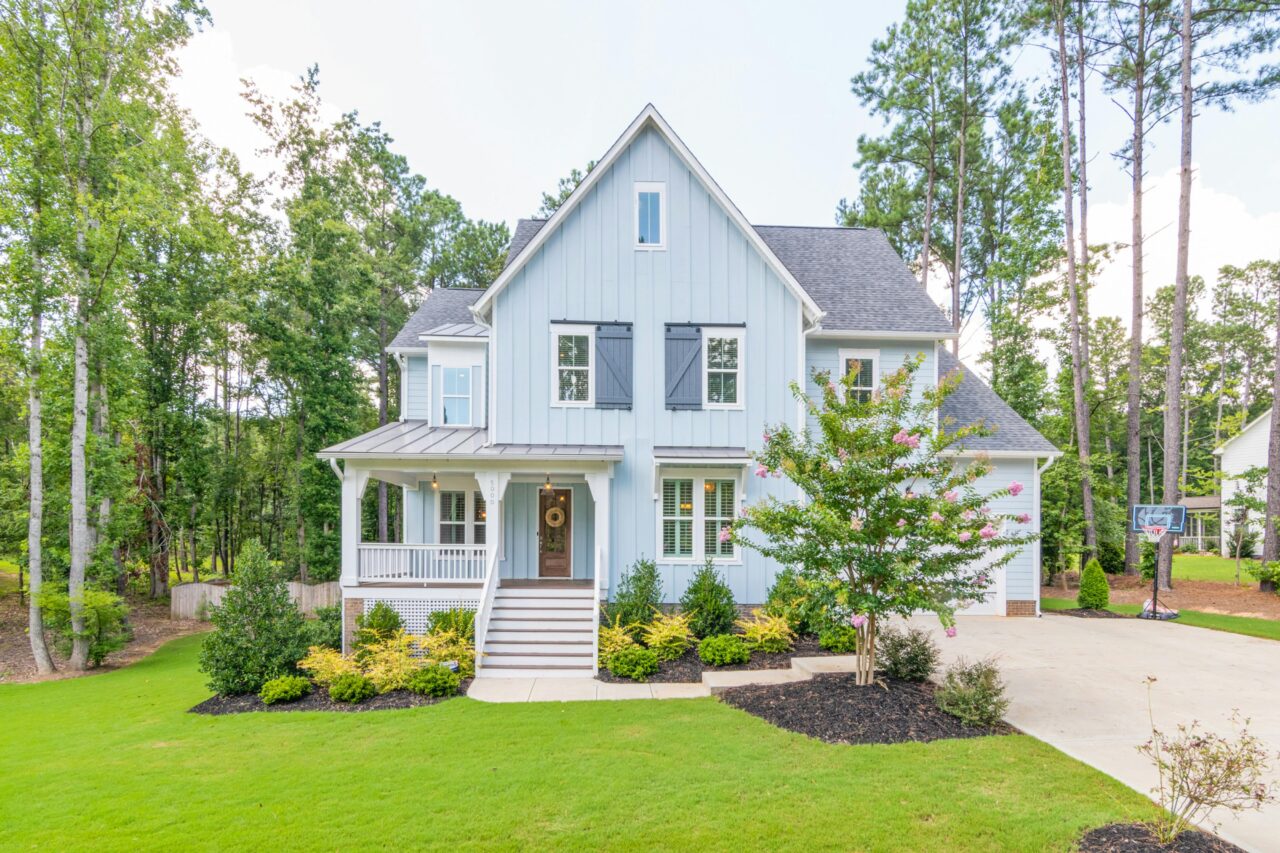
Color plays a crucial role in the aesthetic appeal of your home. While the primary color of your house sets the tone, accent colors can elevate its visual appeal by emphasizing architectural details, creating contrast, and drawing attention to your home’s best features. Used strategically, accent colors can make a house look more dynamic, harmonious, and visually engaging.
This guide will explore how to effectively use accent colors to highlight your home’s features, boost curb appeal, and create a cohesive design that reflects your personal style.
What Are Accent Colors?
Accent colors are secondary or complementary hues used to enhance specific elements of a home’s exterior or interior. These colors are typically more vibrant or contrasting than the primary color scheme, creating a striking visual effect.
Common areas to apply accent colors include:
- Doors and shutters
- Window frames and trim
- Porch railings and columns
- Architectural details like eaves, molding, or decorative elements
- Garage doors
By thoughtfully choosing and placing these colors, you can highlight unique features and add personality to your home.
Choosing the Right Accent Colors
Selecting the perfect accent color involves a blend of creativity, design principles, and an understanding of color psychology.
1. Understand Color Theory
Color theory can help you choose combinations that are pleasing to the eye. Common approaches include:
- Complementary Colors: Colors opposite each other on the color wheel, such as blue and orange, create bold contrasts.
- Analogous Colors: Colors next to each other, like blue and green, create a harmonious look.
- Monochromatic Schemes: Variations of a single color add depth without clashing.
2. Consider Your Home’s Style
The architectural style of your home can guide your choice of accent colors. For example:
- Colonial Homes: Stick to traditional, subdued tones like white or black for trim and shutters.
- Modern Homes: Experiment with bold, vibrant colors or high-contrast schemes.
- Craftsman Homes: Earthy tones like deep reds, greens, and browns complement the natural materials often used in this style.
3. Coordinate with the Environment
Take cues from your surroundings. Homes near the beach may look stunning with soft blues or sandy neutrals, while houses in wooded areas might benefit from deep greens or earthy browns.
4. Balance with the Base Color
Your accent color should enhance, not overwhelm, the primary color of your home. If your base color is neutral, a bold accent can create a striking effect. For homes with a vibrant base color, consider muted or complementary accents.
Using Accent Colors on Specific Features
Once you’ve chosen your accent colors, apply them strategically to highlight your home’s features.
1. Front Door
The front door is a focal point and one of the best places to use an accent color. A bold door color can make a statement and set the tone for your home’s personality.
- Red: Energetic and welcoming, red is a classic choice that stands out.
- Blue: Evokes calmness and serenity, making it ideal for coastal or modern homes.
- Yellow: Bright and cheerful, yellow adds warmth and charm.
- Black: Timeless and sophisticated, black pairs well with most base colors.
2. Shutters and Trim
Shutters and trim are natural areas for accent colors, as they frame windows and doors, drawing attention to these features.
- White Trim: Classic and clean, white works with nearly any base color.
- Dark Trim: Colors like charcoal, navy, or forest green create contrast and add depth.
- Bold Shutters: Bright or contrasting colors can add character and charm to your home’s façade.
3. Porch and Railings
Accentuating your porch or railings can enhance your home’s entryway and create a welcoming vibe. Use a complementary or coordinating color to tie these features into the overall design.
- Wood Stains: Natural wood tones work beautifully for rustic or Craftsman-style homes.
- Painted Railings: Match or contrast with the trim for a cohesive look.
4. Garage Door
Often overlooked, the garage door is a significant part of your home’s exterior. Use accent colors to make it stand out or blend seamlessly with the rest of the design.
- Blend with the Base Color: This minimizes the visual impact of a large garage door.
- Contrast for Impact: A darker or complementary color can make your garage door a striking feature.
5. Roof and Eaves
Accent colors on eaves, fascia boards, and soffits can subtly enhance your home’s architectural details. Choose shades that complement the roof and overall color scheme.
Tips for a Balanced Look
Using accent colors effectively requires a careful balance to avoid overwhelming the design.
1. Follow the 60-30-10 Rule
This interior design rule also works well for exteriors:
- 60% Base Color: The dominant color of your home.
- 30% Secondary Color: Used for large accent areas like trim or shutters.
- 10% Highlight Color: Reserved for bold elements like the front door or small decorative details.
2. Test Before Committing
Paint samples on different parts of your home and observe them at various times of the day to see how the colors look under changing light conditions.
3. Consider Texture and Material
The texture and material of your home’s exterior can affect how colors appear. For instance, colors on brick or stucco may look different from those on wood or vinyl siding.
4. Use Neutral Colors Wisely
Neutrals like white, gray, and beige can serve as a backdrop for brighter accents, ensuring the overall look remains balanced.
Examples of Effective Accent Color Use
Here are some real-world examples of how accent colors can transform a home:
- Colonial Elegance: A white base with black shutters and a vibrant red front door creates a classic, timeless look.
- Modern Chic: A gray base with white trim and a bold yellow door adds contemporary flair.
- Craftsman Warmth: An olive-green base with cream trim and burnt orange accents highlights natural materials.
- Beachy Vibes: A pale blue base with white trim and navy accents evokes a serene, coastal feel.
The Psychology of Accent Colors
Accent colors can also evoke emotions and set the tone for your home’s exterior:
- Warm Colors (Red, Yellow, Orange): Inviting and energetic, these colors draw attention and create a sense of warmth.
- Cool Colors (Blue, Green, Purple): Calming and soothing, these colors add elegance and tranquility.
- Neutral Colors (White, Gray, Black): Versatile and timeless, neutrals provide balance and sophistication.
Accent colors are a powerful tool for enhancing your home’s exterior and drawing attention to its best features. By understanding color theory, considering your home’s architectural style, and strategically applying colors to key areas, you can create a balanced, visually appealing design that boosts curb appeal and reflects your personal taste.
Whether you opt for bold contrasts or subtle harmonies, the right accent colors can transform your house into a masterpiece that stands out in your neighborhood. With thoughtful planning and execution, you’ll have a home that’s as stunning as it is inviting.